Dashboard Demo
Please note that not all the features of the dashboard will work in Internet Explorer. The dashboard works best in Chrome, Firefox or Edge.
Navigation
Each dashboard has multiple pages starting with a main page that includes overall data for one region, definitions and data tables. The second page for each dashboard allows you to see the data for each region at the same time. This makes it easier to compare across regions. Most dashboards have an additional page for comparing data across years. Unfortunately, data is not yet available for these comparisons for all topic areas. There are multiple options for navigating between pages.
On each page, there are buttons that act as links to the other pages. These buttons are the filters sections and are labelled with what is available on the page.
You can switch between pages using the navigation bar at the bottom, by clicking on the arrows.
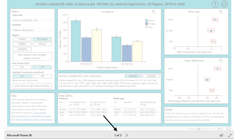
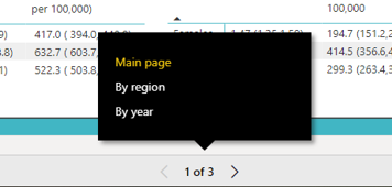
You can also switch between pages by clicking the numbers (e.g., 1 of 2). This will bring up the titles of each page. To go to a page, click on its title.
Filters for data selection
Each page of the dashboard has a box called Filters in the top left corner. Several filters are available within each filter box; those available can differ by dashboard and page. When you change the filters selected, the graphs and data tables will automatically update and display the chosen data.
The filter boxes on the top lefthand side of each dashboard page start with a Topic area drop-down filter. When you click the arrow next to the filter, you will be given a full list of options. Clicking the name of the option or the button next to it will select it.
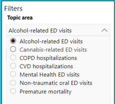
The topic area filter allows you to specify the topic area (e.g., alcohol-related ED visits, mental health). Currently, each topic area has only one specific indicator associated with it (e.g., excellent or very good mental health) which is displayed in the title. A definition of the indicator for the selected topic area is provided in the centre box (located in the middle of the screen, under the bar graph) when the Indicator button in the box is selected.
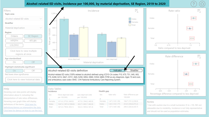
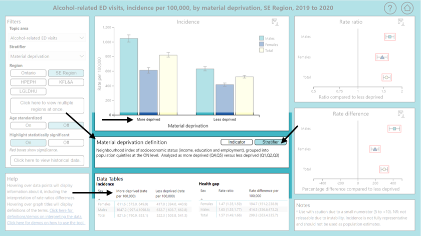
The Stratifier filter (the second filter option in the Filters box) allows you to select which social characteristic to display data for (e.g., education, income, immigrant status). Different options are available for individual level stratifers and neighbourhood level stratifiers. The groups within each stratifier can be seen in the data table and along the x-axis of bar graphs (e.g., high school diploma or less vs more than high school for education). A definition of the stratifier is provided in the centre box (located in the middle of the screen, under the bar graph) when the Stratifier button in the box is selected. The technical documentation includes full derivations for the stratifiers. Click here to download.
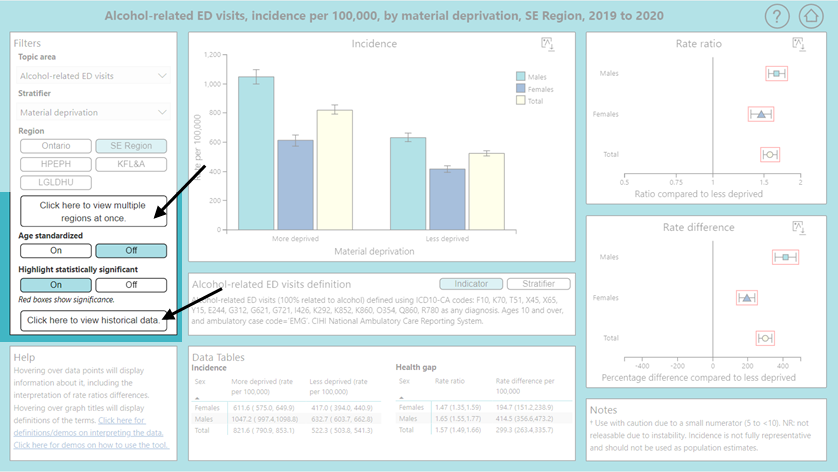
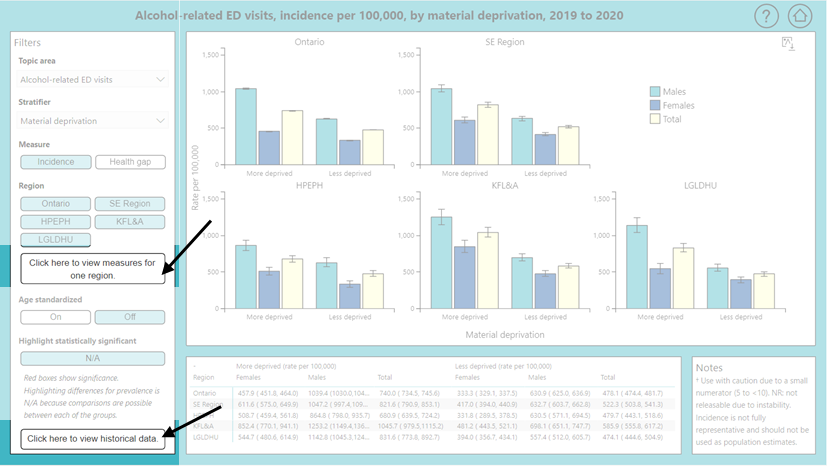
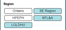
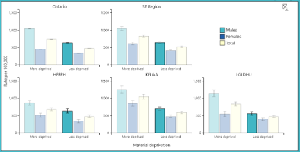
On each page, the Region filter appears as buttons. On the main page, the user can select only one region. On the second page, the user can select multiple regions at the same time. Selected regions have a coloured background and un-selected regions are white. Regions can be selected/un-selected by clicking on their respective buttons.
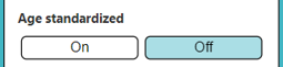
Each page of the dashboard also allows the user to select whether to display the data age-standardized or not. These are also buttons, with only one option allowed to be selected at a time. A definition for age standardization can be found here. Age standardization is not available for indicators with survey-based data sources.
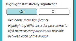
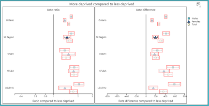
To make identifying statistically significant differences in the health gap measures easier, there is a button that allows the user to highlight these differences. When the button is on, red boxes will appear on the graphs around statistically significant rate ratios and rate differences. More information on statistical significance, including a definition, can be found here.
Note: The feature highlighting statistically significant differences is not available for prevalence/incidence measures as multiple comparisons are possible between each of the groups (i.e., each bar of every figure), as well as between regions. This means that there may be a ‘N/A’ button instead of ‘On/Off’ for ‘Highlight statistically significant’.
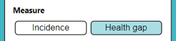
Pages (other than the main page) also have a button that allows you to choose between showing prevalence or incidence (the bar graphs) and health gaps (rate ratios and rate differences).
Interacting with the graphs
The graphs in the dashboard are interactive and offer many features to show more data or make comparisons easier. You can also download the graphs for use outside of the dashboard.
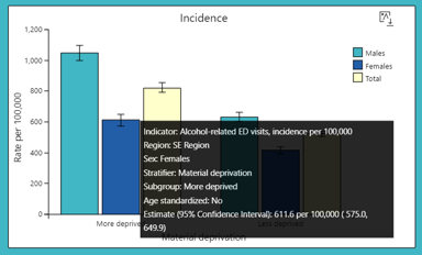
All of the graphs are interactive and have a ‘tooltip’ that displays when your mouse is ‘hovering’ over a bar/data point. The tooltip for the bar graphs shows the indicator, region, sex, stratifier, subgroup (social grouping of the stratifier), whether or not the data is age standardized, and estimate. The estimate contains the value for this data point as well as the 95% Confidence Interval (click here for a definition of confidence interval). The estimate is also available in the data table.
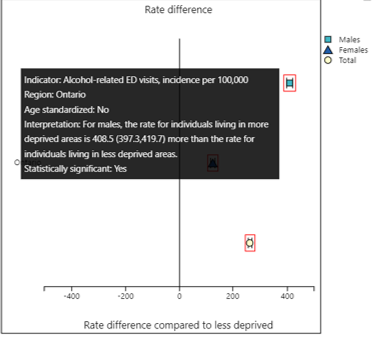
The tooltip for health gaps shows the indicator, region and whether or not the data is age standardized. It has a sentence explaining the interpretation of the data point and says whether or not there is a statistically significant difference. The estimate of the health gap by itself is also available in the data table.
Brief definitions for rates (prevalence and incidence), rate ratios and rate differences are available in tooltips when the user hovers over the title (i.e., on the hovering over the rate difference title on the above graph will bring up a rate difference definition).
For pages other than the main page, you can also click on the data points to select them. In the bar graphs, for example, clicking on a bar highlights equivalent bars in other graphs. This means the same measures for the same subgroup and sex will be highlighted across each bar graph.
For health gaps, this means that both health gap measures (rate ratio and rate difference measures) will be selected for a specific region, sex, and year. The purpose of this feature is to allow for easier visual comparison across graphs.
Clicking on a different data point will switch the highlighting to it. Clicking on any of the currently selected data points will turn off the highlighting, as will changing some of the filters.
All of the graphs generated by the dashboard are available for download with supplementary information (e.g., data points labelled, data source notes and a full title). See below for an example. This is the recommended way of using graphs from the dashboard outside of the dashboard.
In order to generated this image file, first click on the download icon, found at the top right of each graph. After clicking it, a new small image will appear to the right. Right click on this image and choose 'Save image as'.
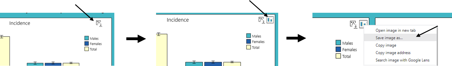
Each time you change the data in the graph, a new image file will have to be generated. The old file will disappear, and you can generate a new one by clicking on the download icon again.
Please contact us if data is required in an alternative format using the Contact page available here.
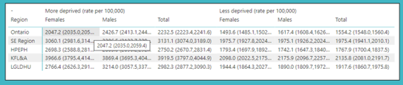
Each page contains data table(s) with the data displayed on the graph(s) on the page. Sometimes, the full numbers do not fit and are replaced with ellipses. Hovering over the cell will provide the full number.
Help and other features
There are some built-in features in the dashboard to help you use it.
In the bottom left corner of the main page there is a Help box. Brief instructions are provided for using the tool (specifically pointing out the tooltip features and navigating between pages). There are also links to the full definitions page and this page (demos on how to use the tool).
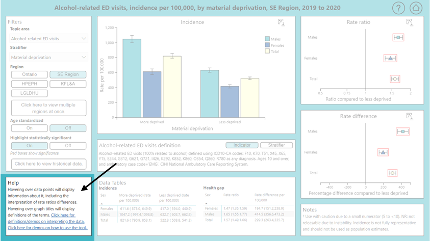
In the bottom right corner of all pages, there is a notes box contianing information relevant to the interpretation of the data.
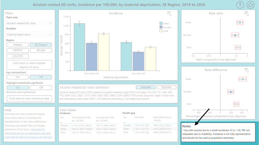
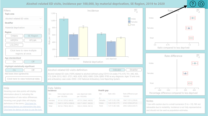
At the top right of each page there are about (question mark) and homepage (home) buttons. When your mouse is over or 'hovering' on the about button, this will bring up a tooltip with more information. When you click on the home button it will bring up the homepage for the Southeast Health Equity Dashboard (i.e., the page with all the links to the different dashboards and supporting documentation). This will open in a new tab on your browser.