Dashboard Definitions
The percentage of people with a health-related outcome in a specific time-period. It is often called a rate. Prevalence is used to measure how common a health-related outcome is in a group of people. For example, the percentage of people reporting excellent or very good mental health. Health behaviours are also measured using prevalence. For example, the percentage of individuals who met physical activity guidelines in 2015/2016.
How often a health-related outcome happens in a group of people in a specific-time period. Incidence is generally used to measure the number of new cases of a disease in a group of people (e.g., Lyme disease in 2018). It can also measure how often health-related events happen such the number of emergency room visits due to unintended injuries in 2016. It is calculated by dividing the number of new cases by the number of people that are at-risk for the outcome during a specific time period. It is usually multiplied by a unit of the population (e.g., 100, 1000, 100 000 people) and often referred to as a rate.
The difference in the prevalence or incidence of a health-related outcome between two groups of people. Health gaps happen when certain social groups experience a lower level of health than the most advantaged social group. Health gaps can be measured in several ways; in this dashboard, rate ratios (RRs) and rate differences (RDs) are used.
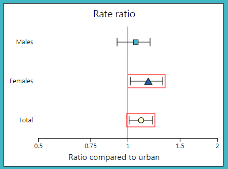
A relative measure of the health gap between two groups of people. It is calculated by dividing the rate in one group (comparison) by the rate in another group (reference). It shows how many times higher or lower the rate of a health-related outcome is in the comparison group compared to the reference group.
To interpret a RR, it is compared to 1. A RR greater than 1 implies that the rate in the comparison group is higher than the rate in the reference group. An RR less than 1 implies the rate in the comparison group is lower than that in the reference group. In the dashboard, RRs are plotted on a graph with 1 as the centre line and on a logarithmic scale (see image below). If the confidence interval does not cross 1, the RR is considered statistically significant. In the graph, these are the data points with red boxes around them. This means that there is a health gap between the two groups.
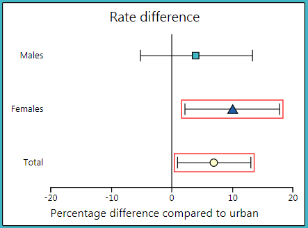
An absolute measure of the health gap between two groups of people. It is calculated by subtracting the rate in one group (reference) from the rate in another group (comparison). It shows the number of cases of the outcome that could potentially be avoided or gained if a particular social group had the same rate as the reference group.
To interpret a RD, it is compared to 0. A RD greater than 0 implies that there are more cases of the outcome in the comparison group compared to the reference group. A RD less than 0 implies that there are fewer cases of the outcome in the comparison group compared to the reference group. In the dashboard, RDs are plotted on a graph with 0 as the centre line (see image below). If the confidence interval does not cross 0, the RD is considered statistically significant. In the graph, these are the data points with red boxes around them. This means that there is a health gap between the two groups.
For this interactive dashboard, groups of people are defined by social characteristics such as sex, income, education, immigration status, etc. These are called stratifiers. The stratifiers included in this dashboard may produce gaps in health between groups that may be unfair and avoidable. Unfortunately, not all stratifiers are available in all data sources. This is a limitation of any attempt to measure health gaps, and a social injustice in and of itself.
For each stratifier, each measure (i.e., rates, RRs, and RDs) has been provided by sex and total (both sexes). This helps us understand how sex may work with other social characteristics to produce health gaps. Stratifiers other than sex may also combine with each other in complex ways to create health gaps. Unfortunately, there is not enough data to measure these different combinations.
Whenever possible, individual level stratifiers are used. This means that information on the social group characteristic (e.g. income, education) is reported directly from individuals with the health-related outcome. Unfortunately, individual level stratifiers are not available in many data sources. In this case, linking an individual’s postal code to socio-economic data at the neighbourhood level can be used as a substitute. When this is done, these are called neighbourhood level stratifiers.
Often, social groups within a stratifier must be combined because the number of cases is too few to calculate stable rates and health gap measures. For example, the five income groups, from quintile 1 to quintile 5, are grouped into two groups – quintiles 1-2 are included in the lower income group, and quintiles 3-5 are included in the higher income group.
The technical documentation includes full derivations for the stratifiers. Click here to download.
Age can impact the rates of a health-related outcome. Age standardization is a method used to allow health-related outcomes to be compared between two groups when the age makeup of the two groups is different. The age-standardized rates are rates that would have existed if both populations had the same age makeup (a reference population is used, in this case the 2011 Canadian census population). In the dashboards, both crude rates (rates not age standardized) and age standardized rates are provided for most measures. Age standardized rates are not available where the indicator is derived from survey data. Crude rates are used to describe the actual rate of a health-related outcome in a population.
All estimates for prevalence and incidence measures, as well as health gaps measures, are accompanied by a confidence interval. The confidence interval is the range of values around the estimate within which the true health measure can be expected to fall 95% of the time. Confidence intervals are shown on the graphs with error bars and in text and tables within brackets. Confidence intervals provide an estimate interval, which gives us a measure of precision around the estimate. The wider the confidence interval is, the more variability there is in the data, and the less precise the estimate will be.
Health Gap Measures: For a rate ratio or rate difference, if the confidence interval of the estimate does not cross the centre line, the RR or RD is considered statistically significant. If the confidence interval of the estimate does cross the centre line, the RR or RD is not considered statistically significant. When comparing two RRs or RDs, the statistically significant differences occur when the confidence intervals between two estimates do not overlap.
Prevalence and Incidence Measures: Statistically significant differences occur when the confidence intervals between two estimates do not overlap. Note that some estimates are based on a small number of people (denoted by an † in the dashboard). This means that there is high variability in the estimate. The confidence intervals are quite wide for these estimates, limiting the ability to show significant differences between estimates, even if a true difference between estimates exists.